Posts

Valle Gets a Responsive WordPress E-Commerce Site

Image
  Responsive website design with WordPress and WooCommerce The Brief: Create an ecommerce site that is visually appealing, stable and easy to use Integrate with social media   The Method: Strategy : Main function of site is to showcase and sell the Valle Training Glove line. Web Design and Development : Valle wanted to be portrayed as an innovative industry leader. The overall style for the website is "sporty" and fresh.  High-end photography is key. Technology : Built using WordPress CMS platform. Plugins: WooCommerce, WordPress SEO, WP Smush.it Theme: pk2012 Sold! Widgets: MailChimp, Twitter The Result: The Valle Training Glove website is responsive, easy to navigate, and matches the existing brand. Visit the website Patrick LaJuett manages a website design agency : + LaJuett.com , where he supports clients as a Web technology consultant and search marketing strategy advisor.

Local Business "Pitchin" Clients with Google Sites

Image
New Website: Fastball-U.com – Classes now in-session Local business gets new Google Sites powered website The Brief: Use the website as a means of attracting new pitching students Create a website that is easy to find via search   The Method: Focus on optimization for search and responsive mobile device rendering Light-weight and modern styling Utilize  Google Sites platform  to enable content maintenance via a web browser   The Result: Website features custom logo design, which ties into the business's educational theme Visit the FASTBALL-U website     Patrick LaJuett manages a website design agency : + LaJuett.com , where he supports clients as a Web technology consultant and search marketing strategy advisor.

Lessons Learned from a WordPress E-Commerce Project

Image
Responsive WP e-commerce Project Responsive WordPress ecommerce website design for Valle Training Gloves Launched a WordPress e-commerce website yesterday.  The project was a conversion of an existing DotNetNuke website.  Here are my takeaways from the development process: The Good: Themes are inexpensive, plentiful, and super easy to install Plugins are copious, one-click activation makes life easy WooCommerce set-up is intuitive Dashboard navigation is straightforward Quality hosting providers are abundant The Bad: Theme documentation is sparse WP forums can be slow or unresponsive, so you will be on your own when troubleshooting Small changes to CSS can cause issues in responsiveness "mobile" view Media (images) can be a pain to upload and replace Performance can be sluggish In Summary: The development process was fairly straight forward.  But like every other WP site I have developed, it seems like there are always issues with managing media files.

Google Sites Gets Much Needed Update

Image
More Customization of Google Sites Themes Now Possible! Earlier this week, Google Sites added improved functionality to enable more theme customization.  The update removes previous limitations set on the sizing of text, specifically in the horizontal navigation interface. To access the new Google Sites features: Manage Site - From the "More" menu, select "Manage site". Themes, Colors, and Fonts - From the "Manage Site" screen, select "Themes, Colors, and Fonts". Customization - Select "Horizontal navigation" to set font size, colors and backgrounds. When finished, Click the "Save" button. Result - Horizontal navigation font size is now customizable.  Previously the nav text size was locked at 10pt. These new Google Sites features enable customization of elements which were previously unchangeable. This flexibility is a welcome UI improvement for Google Sites web designers, site owners, and visitors alike. N

Responsive website developed for "Navigate the Exchange"

Image
Responsive website design with Google Sites cloud based CMS The Brief: Use the website as a means of educating consumers about the new healthcare exchanges Create a website that is informative and easy to use Integrate with Google Apps   The Method: Strategy: The main function of this site is to educate and guide consumers through the new healthcare exchanges. Web Design and Development: Navigate the Exchange wanted to be portrayed as professional and authoritative. The overall style for the website is contemporary and clean. Technology: Built using Google Sites CMS platform .  The CMS allows for easy management and updates – from anywhere in the world.   The Result: The Navigate the Exchange website has a custom look and feel which matches the existing customer brand. Visit the Navigate the Exchange website Patrick LaJuett operates a website design and marketing agency where he supports his clients as a Web technology consultant and search market

Business Card Design Techniques

Image
How to design your company's business cards Digital marketing is replacing traditional print advertising for many companies.  However, a professionally designed and printed business card is still a great way to show off your biz.  To "plant seeds" with potential customers and guide them to your website for more information. Here are some tips to help you on your way: It's important to use elements consistent with company branding.  Logos are a great starting point.  I like to use shapes or angles from the logo and incorporate into the card's background.  Be sure to include all relevant contact info including your website address.  Readability is important, so don't go too small with lettering. Dawn of the Digital Press A digital press enables printers to offer "small run" print jobs.  Because of this, set-up time and costs are less. This allows for experimentation, more color and diversity in your card layouts. Business Card Option

Fix your search rank with super glue not duct tape

Image
Why Duct Tape Isn't a Long-Term Fix for Poor Search Rank Most of my clients, know just enough about SEO to be dangerous. Not meant to be a put down, as I probably know less about their field than they do mine.  They've heard the term SEO, they're not ranking, and they need to do  something .  That something, is to talk with an SEO...this is where I come in. I sit down with a client and they give me the lowdown. Then they throw some questions at me and hope I can give them a sensible answer.  I try my best.  It goes something like this: It's Broke Our Website is "better" than the competition, how come it doesn't rank?  Well turns out the competitor (whether by accident, hard work, or both) has established themselves as an industry authority.  Or they've been lucky...it happens.   Can't you throw a couple of keywords into the meta tags?  Sure, that's a good start, but you need some substance behind it.  Something for the search

Google Sites Web Launch for A Neu Design Interiors, Inc.

Image
Latest Google Sites design project launches A Neu Design Interiors, Inc. hired us to redesign their company website. Their primary requirement was to have an easy to manage website that showcased their home remodeling work.  Long-term they hope to attract quality leads by implementing a search optimization strategy, centered around social media and content-rich blogging. A Neu's new Google Sites features responsive architecture which adapts to fit the users device Technology summary: Google Sites (CMS) Picasa 3 (image management) SimpleViewer (gallery template) Google Drive (file hosting) Google Analytics (visitor engagement measurement) Google Webmaster Tools (SEO) Site features: Responsive web design (RWD) Social media hooks (Facebook, LinkedIn, Pinterest) Micro blog with RSS XML photo gallery Search optimization Patrick LaJuett operates a website design and marketing agency where he supports his clients as a Web technology consultant and sear

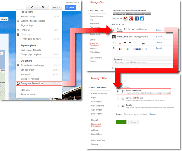
Manage Google Sites Permissions

Image
One of the most powerful features of Google Sites is the ability to control user access.  For example, you can create a private site (hidden from the general public).  This private site can be accessed via a secure login as defined in the Sharing and Permissions settings. The workflow we use when developing a new Google Sites website is to initially set permissions to "Private".  This way we can freely collaborate with stakeholders without concern of a random visitor stumbling upon the work-in-progress. We rough-in, then refine the site's content as a team.  When ready to launch, all we have to do is "flip the switch". Here's a tech post on how to make your entire Google Sites visible to the public: https://lajuett.zendesk.com/entries/23826192-Make-your-Google-Sites-public Note, permissions can also be set on a individual page basis. Google Sites permissions - Ready for the world. Patrick LaJuett operates a website design and marketing agen

Photo Gallery for Google Sites

Image
Photo Gallery Solution for Google Sites SimpleViewer Picasa gallery in Google Sites After hours of research, I finally came up with a method for displaying Picasa photo gallery thumbnails in Google Sites.  The default Google Sites Picasa gadgets (single photo and album slideshows) were not flexible enough (in my humble opinion). My solution was to utilize the new html hosting features of Google Drive and linking, via iframe, to the exported Picasa folder.  It requires a few steps, but the final product is impressive.  It even adapts (responsive) to mobile devices! Here are the steps: Get SimpleViewer app Download and install  SimpleViewer Picasa Template In Picasa (desktop version) From Picasa 3.9 , export your photos as HTML Choose the SimpleViewer template In Google Drive Upload the entire folder created in previous step to Google Drive Set the folder permission sharing to public Copy the folder ID In Google Sites Add iframe gadget to page Set URL