Top 10 Design Tips for Banners Ads
More Clickable Ad Banners
It's been a while since I designed online ad banners. Back in the mid-2000s, I did a lot of them for AOL's YP ad campaigns. The small size constraints certainly can present a challenge. Here are some things I have learned over the past decade or so.
MY TOP 10 AD BANNER DESIGN TIPS:
- Use standard size ads (https://support.google.com/adsense/answer/6002621?hl=en)
- Make text as large as possible for legibility
- Adhere to existing branding specs
- Use glows and shadows to help text "pop"
- Use visually interesting photos
- Compress files as much as possible
- Test color blindness rendering (http://color-blindness.com/coblis-color-blindness-simulator)
- Incorporate ad size into naming conventions (i.e., WW-Puget-336x280)
- Get approval on one ad size before creating additional sizes
- A/B test design variations as well as call-to-action text
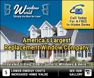
Here are some example of our recent ad banner designs...


