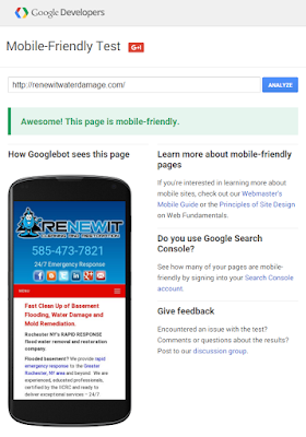
Sites - Passing Google's Mobile-Friendly Test
Responsive menus, adapative columns, and 100% width images
One of the biggest benefits of a Google Site is it's built-in RWD (responsive web design) feature.
Be sure to enable the general settings... mobile checkbox: "Automatically adjust site to mobile phones".
The adaptive rendering maybe not as elegant as some WordPress themes, but the ease of set-up and rapid development is a benefit to small business owners with modest budgets.
Update: I forgot to mention a feature that I haven't seen with other platforms. Google Sites allows you to "Preview page as viewer" and toggle between mobile | desktop views. Very cool UI tool.
Update: I forgot to mention a feature that I haven't seen with other platforms. Google Sites allows you to "Preview page as viewer" and toggle between mobile | desktop views. Very cool UI tool.
 |
| Google Sites pass the "mobile-friendly test" |


Comments