Visual Attention Prediction Tool - Optimize Your Landing Pages
"Eye Tracking Without the Eyes" - AttentionWizard uses advanced artificial intelligence algorithms to simulate human visual processing and attention. The software instantly creates an "attention heatmap" of your Web page that predicts where someone would look during the first few seconds of their visit.
We decided to test the app by analyzing LaJuett.com. The results were interesting, and definitely helped us evolve our site in effort to more cleary communicate with our customers.
Our Attention Wizard Test
----------
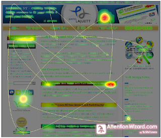
STEP 1: Analysis of original site layout
We uploaded a screen capture of our Website and received the following heatmap result in the form of a PDF.


 In Conclusion
With 4 simple steps, we were able to decrease the "busyness" of our landing page, and focus user attention on the key call-to-action elements.
AttentionWizard is definitely worth a look. The free "Lite" account allows you to upload and generate one heatmap image per day. They also have paid accounts which allow you to generate unlimited watermark free images maps.
We decided to test the app by analyzing LaJuett.com. The results were interesting, and definitely helped us evolve our site in effort to more cleary communicate with our customers.
Our Attention Wizard Test
----------
STEP 1: Analysis of original site layout
We uploaded a screen capture of our Website and received the following heatmap result in the form of a PDF.

Notice the eye tracking paths appear to zig-zag as well as bounce across the screen. Also, the hot spots are not where we want them. Users are focusing on less important information and not our key call-to-action elements.
----------
STEP 2: Modify original site UI to highlight call-to-action elements
We created a "Get Free Quote" button and placed in upper left-corner of page. Here is what the new heatmap looked like.
The eye path has been simplified, and we now see a hotspot on the new button we added. We're still seeing hotspots on less important areas of the page. The user's eye is being drawn to areas of rich saturated color.
----------
STEP 3: Mute site colors to minimize attraction to non-essential design elements
We tweaked the CSS and decreased the number of colors on the page. DIV backgrounds we're changed from gold, red, teal to a muted light-blue.

Notice the results of the updated heatmap. The users eye is now being attracted to our call-to-action elements. Getting better...but still a couple of areas of concern. The negative space between our company logo and our portfolio thumbnails is a wasted focal point. The logos below our social media icons are causing distraction.
----------
STEP 4: Move social bookmark link and desaturate colors on secondary logos
To further direct eye movement, we moved our ShareThis link to the empty area located to the right of our logo. We also muted the PayPal and Volusion logos in the left-hand column. Results below.
With 4 simple steps, we were able to decrease the "busyness" of our landing page, and focus user attention on the key call-to-action elements.
AttentionWizard is definitely worth a look. The free "Lite" account allows you to upload and generate one heatmap image per day. They also have paid accounts which allow you to generate unlimited watermark free images maps.

Comments